

Rise of Dark Mode Culture and How it Took Over 2019
When taking a look at iPhones, one may stumble upon an application interface that uses “dark mode,” light icons and text-oriented onto a dark background.
Screens were initially limited to a dark mode. The display technology wasn’t advanced enough to project the color white onto a screen back in the ’60s and the iconic green-on-black hacker-esque text as standard.
Thanks to science’s computational evolutions and technological advancements, screens have rendered the ability to advance to the color white, with designers quickly scrambling to make everything light mode. Ever since then, the dark-on-light color scheme has been default to many.

Sophomore Cooper Hancock leisurely scrolls through Instagram during class. Hancock chooses to use dark mode as it is easier on his eyes.
In today’s world, display technology and interface design are taking a step back to its roots: the dark side.
The design language of media applications has evolved, with dark mode being one of the steps that the graphical user interface design world has embraced in the past couple of years. 2019 was the year to make dark mode the norm.
There have been a couple of earlier adopters—including YouTube and Twitter—who have had the feature since 2017.
However, one by one, the number of dark modes released has skyrocketed. The Verge, a tech media outlet, has a stream of significant applications that have received dark mode over the years. Here’s a notable list:
2017
- Twitch.tv App receives dark mode
- Windows 10 receives dark mode (unrefined, though)
- Reddit’s most requested feature delivered: dark mode
2018
- Microsoft’s Outlook receives dark mode.
- Firefox receives dark mode.
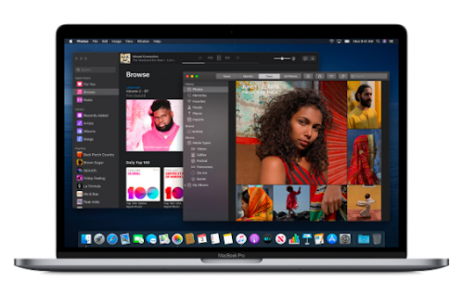
- macOS Mojave gets dark mode.
- Microsoft’s Office receives dark mode.
- Android announced to get a dark mode.
- Google Pixel: Has a choice between dark or light.
2019
- Twitter receives OLED-friendly’ Lights Out’ mode.
- Google Chrome receives native dark mode.
- Slack receives dark mode.
- Facebook’s Messenger receives dark mode.
- Google announces fully native Android dark mode in development.
- iOS 13 receives dark mode.
- Gmail receives dark mode.
- Apple Music receives dark mode.
It is an epidemic that has swept across the globe and right into our smartphones.
Apple’s iPhone operating system, iOS 13, brought Dark Mode into the limelight. It was a significant reason for many to scram for that update button buried in the settings application, as well as many considerable media applications to give in to the dark side.
Accompanying the release of Apple’s system-wide dark mode, Instagram released a dark theme on October 8, 2019 which took the mass media by surprise.

This sample text shows the two text color schemes side by side. When looking closely, one may experience a corona or haloing effect around the white text over the black background, while the black text remains crystal clear.
It was an unanticipated event. Many posts on other media platforms expressed both high praise, as well as a distaste for the look, as there was simply no way to enable light mode without affecting the look of the iPhone’s entire digital ecosystem.
But one may ask: Why? What is the point of so many companies attempting to create more work for themselves? And for whatever reason, is there any benefit to it?
“Dark mode is a dramatic new look that’s easy on your eyes and helps you focus on your work,” Apple claims when releasing the operating system macOS Mojave. “[Dark Mode] makes it easier for anyone to use a device in a low-light environment.” Additionally, Microsoft says it can potentially improve battery life, reduce eye strain, or appeal to your aesthetic senses
Although there is some truth behind these claims, science is a little more complicated than that. In other words, it just isn’t for everybody.
“I do not think dark mode affects eye health in any way given the data that is out there in the literature. The duration of use is likely much more important than the mode or the intensity of the brightness of the device when it comes to the effect of this dark mode on eye fatigue and potentially eye health,” expert, Euna Koo, an ophthalmologist at the Stanford Byers Eye Institute, tells CNN,
Eye strain is not fully proven, but the shortened battery life is a total reality and could possibly be the reason for a recent uprising in dark modes.
Apple expresses their support for dark mode by releasing a night theme design for macOS Mojave. This photo shows up on the help page for dark mode.
There are two leading display technologies: light-emitting diode (LED), and an organic light-emitting diode (OLED). The main difference between the two is that LED, which uses the help of a backlight to power it. At the same time, OLED allows for more vibrant contrast and true blacks.
To put it into simpler terms, traditional LEDs do not have a pure black due to the pixel still emitting a tiny bit of light while OLED exposes the deep colors with its ability to dim individual pixels.
The power consumption of two new iPhone XS’s OLED displays were put to the test by YouTuber PhoneBuff, one on dark mode, and one in light. The phone with light mode enabled died first, leaving the one in dark mode with ~30% to spare. Both phones were running at 200 nits. It is crucial to keep in mind that this does not apply to LCD or LED screens.
To get a little bit more on the technical side, we can even bring up the concept of “halation,” which is the leakage or spreading of light from a screen or photograph outside of its physical boundaries.
The concept of halation is more prevalent on those with visual impairments such as astigmatism; however, just by looking at the image below, one may experience the effect while attempting to read the white text on black background compared to its positive counterpart.
Halation may be related to how scientists have concluded that the hardwired human brain prefers to look at dark-on-light, even prehistoric cave drawings are dark colors (charcoal) on light backgrounds (light rock). It is merely unnatural according to the human brain.
The cons do not outweigh the pros and vice versa. In the end, it is up to personal preference. Having the choice between the two is a privilege, and it is a nice touch for the devices that many of us stare for hours daily.
Bill Zhang ◊ Mar 5, 2020 at 9:11 pm
It be really cool to see a function that converts a dark-themed document into a light-themed one without disturbing all the images so the image is optimal for printing.
The Sage should have a dark mode. But one that is a very dark gray with a tiny hint of blue rather than all out black. Programming IDEs have it good.