Brand New Look has School Loop Users Going for a Loop
Oct 3, 2018
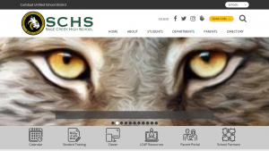
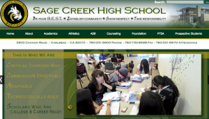
The School Loop website as we knew it is no more. A new School Loop website design was unveiled on the weekend of Sept. 8.

The new School Loop homepage has a very fresh, new look. The website’s design was updated early this year, surprising many students and staff.
The new design portrays a simpler, more organized look. The district’s goal is to create websites for all their schools that are more uniform and easier to navigate. The district worked hard to design the new webpage over the summer to have it ready for the 2018-2019 school year.
Assistant principal Chris Robertson was involved in the process of redesigning the site.

The old School Loop homepage had been used by Sage Creek students since day one. The website was known fairly well by most of the students.
“We met with a member of the district’s tech team and we worked out a lot of the different little issues… We really cleaned it up so now the site that you go to today is a very clean, accessible and organized website,” Robertson explained.
Robertson, administrative assistant Jennifer Hatter and Vicki Ruby, the SCHS school registrar, all played a major role in customizing the fresh, new look for this upcoming school year.
Math teacher Susan Woolley uses School Loop daily to post assignments and update grades. She originally customized her profile page so that student resources were easily accessible.
“I’m just having a hard time getting it to look like something that parents and students can use. I feel like it is harder to find stuff than it was before,” Woolley said.
Sophomore Arin Gadre, like many other students, uses the website each day to check grades and current assignments. Gadre has found a few things about the new website that he is still unsure about.
“I prefer the old one because the login screen was very accessible to me and the other students,” Gadre said.
Although the new page will take some getting used to by staff and students, the future of School Loop looks promising.


Aman ◊ Oct 8, 2018 at 4:45 pm
Although it is much more organized and sleek, the UI has many differences, all of which were implemented into only one update. This drastic UI change really puzzled many students when first implemented, especially when coupled with the broad banners and icons. Despite the very great intention for these changes, they were implemented a little too fast to be “comfortable” per se.
Personally, I love the changes, however, I strongly dislike the large banners along the pages. They become cumbersome, especially on the home page and on mobile devices. If the banner were thinner, I believe that it would remove that cluttered-feel from the website.
AnGeL :) ◊ Oct 5, 2018 at 6:57 pm
Honestly I think the old one is better because we’re so used to the old one and we had it for a long amount of time and all of a sudden they changed the format . We knew were things were and how to find them know I feel like its harder to find things, thats just my opinion.
Ethan ◊ Oct 4, 2018 at 10:45 am
It feels way too reorganized… we’ve used the old layout for so long, now everything is in a different place, Many of the shortcuts that used to be on the main page are now hidden away behind more different pages, and the login button is at the far bottom of the screen for whatever reason.